The “hackathon” at CMP Innovation Studio
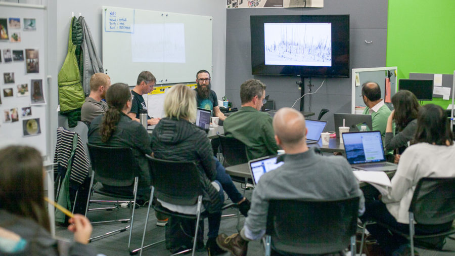
On Tuesday Nov. 7 2017, a dozen members of the Museum Computer Network convened to Carnegie Museums of Pittsburgh’s Innovation Studio for a “data hackathon”.
No long nights, no pizzas, no cash prize : this wasn’t really a hackathon.
Just a few curious people willing to openly share what they were working on, gathering in the same space for a few hours.
Hunches
When we wrote the proposal and call for participants, we did want to look at open access data sets, using data visualization tools, with the hunches that these could be interesting in terms of :
- Evaluation : What can your data tell you about your visitors and your collection? How can this feed your digital strategy?
- Data-led storytelling : Can data help you decide where to focus your interpretation efforts?
- Data-backed storytelling : How can data not lead but strengthen and support your narratives?
- Accessibility : How can you increase accessibility with big data and machine learning? (eg. reducing costs of translations)
- Strategy/etc : What do you get from “opening” your collection? Feedback from institutions that have just done it.
CMP’s Innovation Studio
CMP’s Innovation Studio is located within the Carnegie Museum of Natural History, adjacent to the Carnegie Museum of Art.
Carnegie Museum of Art. Yes, it is snowing.
The Studio is the design, development and workflow laboratory at Carnegie Museums of Pittsburgh. It is a collective of cultural technologists working to support a culture of innovation throughout our museums, which include Carnegie Museum of Art, Carnegie Museum of Natural History, The Andy Warhol Museum and the Carnegie Science Center.
To get there is, in itself, quite a journey. Here are Jeffrey Inscho’s directions:
1. Take elevator to 3rd floor of Natural history museum. Enter Polar World
2. Take a selfie with the polar bear
3. Meander through the igloo
4. Enter Native American Hall
5. Climb aboard the fishing canoe
6. Proceed past the Sitka spruce
7. Listen for the Hopi singer and go all the way to the back
8. Make a sharp right and enter the double doors.
9. Welcome to the Innovation Studio!
Lightning talks
It took a little while to get started, get coffee, etc.
By 13h40, we were ready for the first lightning talk.
Chad Weinard
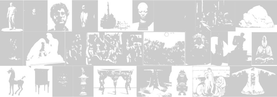
Chad Weinard spoke about releasing The Williams College Museum of Art collection data (see New Dimensions for Collections at WCMA).

A montage of the digitized collection focusing in on a narrow “pink” range — Chad Weinard
WCMA released their open-access collection data on GitHub as a CSV file, along with a downloadable set of collection images. Both are key resources for the Computer Science and Math departments on campus, as well as digital humanities programs more broadly.
Chad described how open-access collection data drove recent exhibitions and collaborations at WCMA.
The exhibition Accession Number displayed works of art in order based on their unique identifier. (The installation even included placeholder graphics for works of art that had been lost and deaccessioned.)
The Pink Art exhibition took the idea a step further, displaying works of art based on color data. WCMA collaborated with computer science students and faculty to develop a community-sourced definition of “pink”, and then create bespoke algorithms to rank the WCMA collection from most-pink to least. Curators used visualizations of the algorithms to craft the checklist and exhibition layout.
Both projects challenge the notion that data visualization need be quantitative and screen-based; these exhibitions visualize data as tangible, tactile and subjective.
Another project taking place at WCMA is Walls, where students can borrow an artwork from the collection for a year and hang it in their dorm room. They must write a little story about their experience spending time in the artwork’s company. Then the story is passed on, along with the artwork, to its next temporary owner.
As these stories may be very intimate and were not written with this perspective in mind, one question now is : how can these stories be shared with a greater audience?
Kjell Olsen
Turning raster images into vectors — Kjell Olsen
Kjell Olsen from the Minneapolis Institute of Arts demoed a potrace script that outputs very light versions of images, in grayscale. These can be useful to load web pages faster, or perhaps as a low resolution alternative when usage rights expire.
More on the Minneapolis Institute of Art’s GitHub.
Jeff Steward
Jeff Steward talked about Harvard Art Museums’ statistical landscapes (see Suns Explorer, Collection Activity, Collection Terrains).
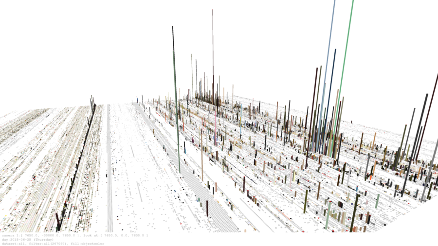
Collections Terrains — Jeff Steward
In Collection Terrains, for example, the data visualization shows how collections change over time, aggregating data from google analytics.
His projects are built in Processing and the source is available on GitHub.
Jeff said something really interesting about being “purposefuly antagonistic” to the common user expectations, in order to get them out of their comfort zone.
Over the last 3 years, Jeff and his team have been doing about 60 projects in the Lightbox Gallery. Most of these projects are collaborations with faculty or external artists. Some may only stay up for one afternoon, others for a couple of weeks or months. As the Museum is open 7 days a week from 10am to 5pm, it means that the set-up and tests often happen in public, who may interact.
Some of these examples were also presented in Beyond the Graphing Calculator: A Deep Dive into Data Visualization and Cultural Institutions, on Thursday morning. Many more links about that excellent session can be found on the Harvard Art Museums’ GitHub.
Tristan Roddis
Tristan Roddis from Cogapp spoke about term extraction using APIs: Clarifai, Google Vision API, Microsoft Computer Vision and IBM Watson.
Cogapp have been carrying out some experiments to automate image analysis, locating images in vast collections of documents and describing them in plain English. They have also found some interesting results in other fields, such as playing ancient music without an instrument.
Proving that “algorithms are non neutral”, Tristan showed what happens when automated analysis goes wrong.
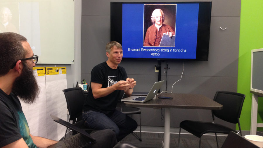
“Emanuel Swedenborg sitting in front of a laptop” — Tristan Roddis
Tina Shah
Having freshly landed in Pittsburgh, Tina Shah showed us “Digital Labels”, an in-gallery digital interpretation project she’s currently working on at The Art Institute of Chicago.
“Digital Labels” example — Tina Shah
Made with react.js, “Digital Labels” works with 360° images to help build continuous narratives about an object, setting the scale and object rotation for each “page” of the experience.
Setting the object rotation in the authoring tool — Tina Shah
Tina also briefly spoke about the AIC’s open source Mobile App, GeoJSON data files, and the difficulties with indoor wayfinding.
The code behind “Digital Labels” will be released as open source on the AIC’s GitHub in a few months.
Tina presented “Digital Labels” Friday in Off the Wall: Examining In-gallery Digital Interpretation. More on that session under #MCN2017-F9.
See also Michael Neault’s Designing for scale and context, knights and dragons.
nikhil trivedi
Also just off the plane from Chicago, nikhil trivedi presented a series of scripts to export old CMS driven sites as static content and the Data aggregator.
What’s really worth noting is the AIC’s approach to develop in-house a single unified source for all of the institution’s public data — from collections to shop inventory, events, mobile tours, digital catalogues and static sites representing the AIC’s history on the web. It is now a requisite for outside providers.
More on the AIC’s GitHub.
Elena Villaespesa
Elena Villaespesa talked about the evaluation of Open Access at the Met.
Six months after making available 375,000+ images of public-domain works in The Met collection under Creative Commons Zero (CC0), what’s happening?

Wikipedia page views featuring a Met image — Elena Villaespesa
To sum up:
- on The Met’s website : 150% increase in downloads, users who download images are more engaged with the collection online, visiting 16 pages vs. 3, spending 21min vs. 4min
- on Wikipedia : phenomenal increase in new articles featuring Met images : from 1,034 in February 2017 to 6,761 in September 2017
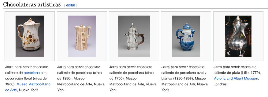
e.g. Met images have been used to illustrate the Wikipedia article about [Hot Chocolate](https://es.wikipedia.org/wiki/Chocolate_caliente#Chocolateras_art.C3.ADsticas) in Spanish
- on Creative Commons Search : Met searches make up 66.42% of total searches. “Van Gogh”, “Monet”, “Botticelli”, and “Picasso” are the most searched terms overall, followed by “cat” and “dog” (!)
See also Loic Tallon’s Celebrating Six Months of Open Access, plus The Met on Google BigQuery and Introducing Open Access at The Met.
Christophe Buffet
Finally, I presented my own research on visualizing stories about a collection.
Over the last couple of years I have recorded lots of interviews and I am interested in visualizing the connections between these stories.
First, I needed to get them transcribed. A demo at Google Campus in São Paulo helped me get started experimenting with Google Speech API’s speech to text tools.
Next, as the transcription of these stories is unstructered data, I looked into text mining tools.
After I started playing with yTextMiner, I realised I needed to dive deeper into Java and Object Oriented programming to make the most of it. However, results generated from yTextMiner are quite difficult to interpret.
Finally, I have come across Tidy Text Mining with R. It is much easier and integrates seamlessly with R’s data visualization package, ggplot2. There are many examples on the Tidy Text GitHub repository, that can be hacked and run on other data sets.
It would be really interesting to run these on a larger corpus of stories about a collection, or across several collections, and visualize the patterns that emerge.
(I also believe that these stories should be shared on Wikipedia too, so that anyone could translate them in their own language for greater accessibility, but this is another story…)
That was basically it… at 16h45, we had hardly any time left for anything. So that was a wrap for the day. We ran off to the Ignite presentations.
Friday follow-up session at MCN
On Friday, Jeff, Tristan, Elena and myself did a shorter version of our presentations.
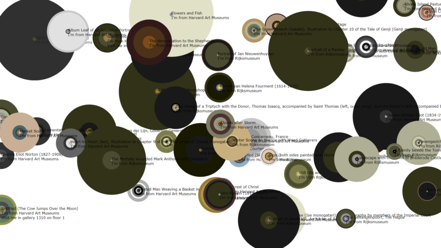
Suns Explorer with data from the Rijksmuseum’s API and the Harvard Art Museum — Jeff Steward
Jeff did have some time to apply some of his algorithms on collection data extracted from the Rijksmuseum API. You can see in the picture above how dark the paintings from the Rijksmuseum are in comparison to the ones from the Harvard Art Museums.
He also found out that many data sets we had listed were already out of date, whereas others were inaccessible. That raises the issues of standards in OpenAccess APIs and CSVs, and maintenance challenges.
After that, Tristan’s When automated analysis goes wrong got many laughs from our audience!
Conclusion
Although not exactly an hackathon, this session proved that there is some interest in the MCN community in getting together and sharing what we’re working on in an informal way.
I jokingly said that the hackathon was hacked. Perhaps I should have been stricter on time-keeping. Really exciting projects were being demoed, conversations started, it felt inappropriate to cut these off.
For another edition, perhaps we need to rename this “hackathon” as a “hands-on” or “work-in-progress” session.
If we really want to work on something together for a couple of hours, we would need :
— to spare the time of getting to know each other, diluting this all along the year, for example on MCN’s slack channel
— to start the afternoon with a pre-set theme and stick to it
Perhaps a local organisation could sponsor this session and throw an “How might we … ?” challenge.
What I am really curious to find out now is whether and how we are going to use the things that have been shared.
What new ideas will be sparked by these presentations?
What institutions, large or small, well funded or not, will “fork” these projects to build their own, and “merge” their improvements back?
Ideas? Comments? Suggestions? Please do leave some comments here and let’s keep the conversation going on MCN’s Slack channel.
Participants (in alphabetical order)
Christophe Buffet, Misty Havens, Jeffrey Inscho, Kjell Olsen, Seema Rao, Tristan Roddis, Tina Shah, Jeff Steward, nikhil trivedi, Jeremy Tubbs, Elena Villaespesa, Chad Weinard.
Thank you all for taking part, and many thanks to Jeffrey Inscho and his team (Regina, Caroline and Sam) for having us at the CMP Innovation Studio all afternoon.